Platforms:
Xbox One, PS4, PC
Released:
May 19, 2017
Publisher:
Grip Digital
Developers:
Right Nice Games, Grip Digital
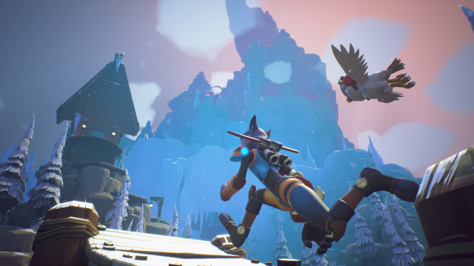
Skylar & Plux: Adventure On Clover Island is a 3D platformer in the vein of classics such as Banjo Kazooie, Super Mario 64, or Spyro. The game is part of what appears to be a small resurgence of the 3D platforming genre, a resurgence that I believe will one day be able to recapture the wonder and amazement of platformers of old. One day, but not today.

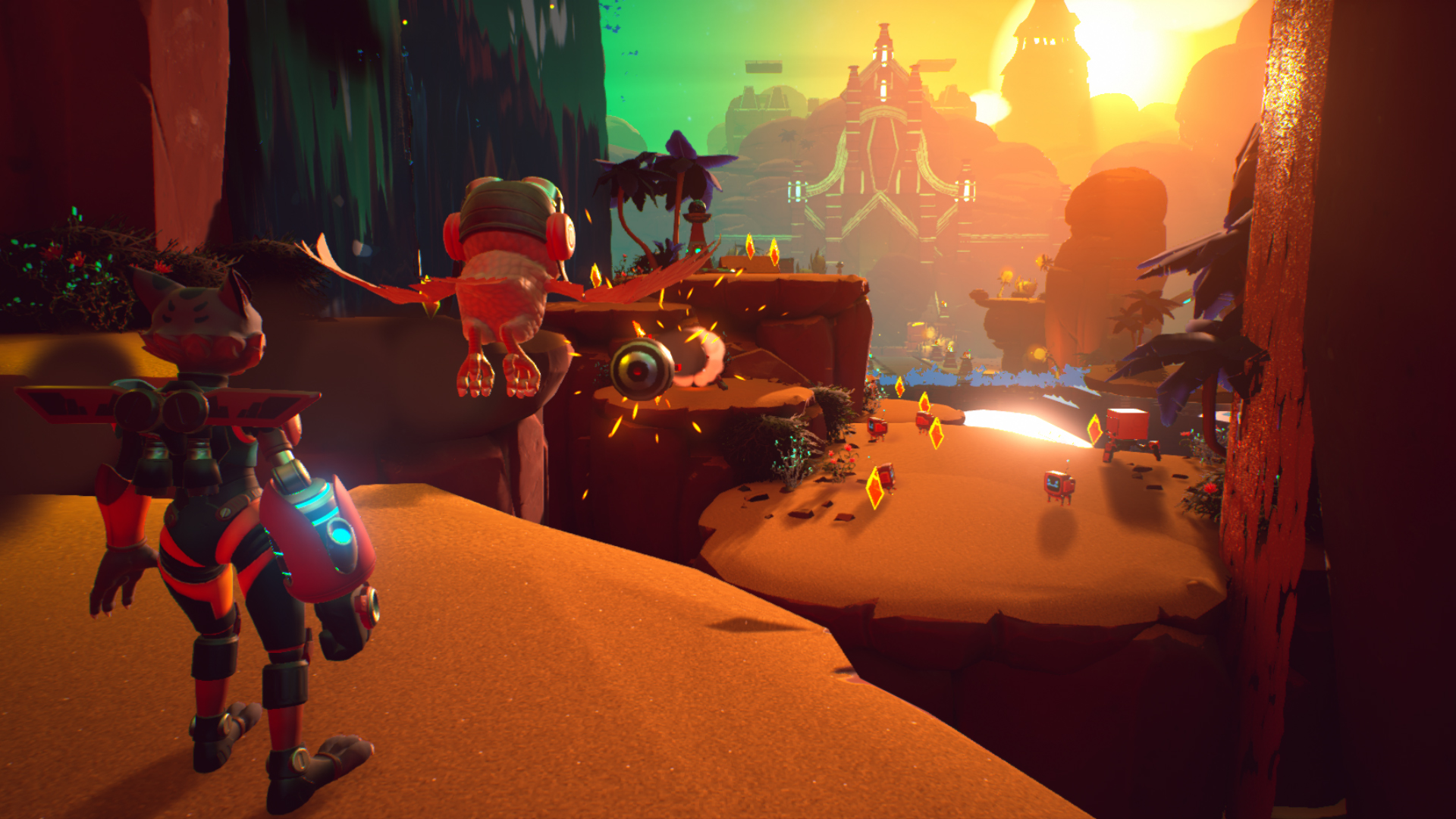
Playing as Skylar, you escape captivation and are thrust into a situation where you’re the hero, saving the village from chaos and destruction. With your new friend Plux showing you around Clover Island, your job is to free the Lo’a natives, retrieve the stolen power orbs and stop CRT, the game’s big bad. I’d describe Skylar & Plux as a buddy-duo if it weren’t for the fact that Plux doesn’t really do anything at all. He sought of just tags along for the ride with the occasional piece of useless advice. Can we coin the phrase cruddy-duo?
Skylar & Plux is a fully capable platformer, but one that either didn’t have the budget or the scope to aim for the stars. At roughly 3 hours long, the game was neither long enough nor to a high enough standard to even come close to replicating the quality of the games it was striving to pay homage to.
Before this review starts sounding too negative, the game actually has a bunch of things it does right. Mechanically speaking, Skylar & Plux was pretty solid. The platforming, the movement, even the camera control (which is usually the bane of 3D platformers) were all more than competent. The game offered multiple movement and combat abilities which played and handled naturally with intuitive and enjoyable controls. Puzzling was also surprisingly good when then game chose to incorporate it.
As new mechanics were introduced, the game was able to do new and creative things. Moving from the present to the past, slowing down time, rocket-jumping, and using the magnetic glove were all fun and novel experiences. With the game only being 3 hours long however, I don’t feel like any one mechanic ever had the time to be used to its full extent.
Also Skylar & Plux’s look and feel is totally reminiscent of the game’s it is attempting to emulate. For that I give it props, it was fantastic being thrown into a world that instantly gave off nostalgia.

Collectables are always a big thing in 3D platformers, Skylar & Plux being no exception. Dotted throughout the world were crystals that worked as both a collectable and a currency. The crystals could be used to unlock Lo’a cages that are hidden around the map, and once a certain amount of Lo’a cages were unlocked, you were rewarded with an increased health pool. This is a great way for a game like this to incorporate collectables because they had a meaningful in-game use. You never felt like you were collecting for the sake of collecting, you had a good reason.
Not everything about the collectable system worked perfectly though. Whilst the game did have incentive to collect, in reality the game never got difficult enough for the reward to be all that necessary. Collectables were also often positioned in a way that left you travelling in a direct path to collect them. This system didn’t allow for much variability in the way you tackle certain areas, and nor was it fun.
“In some areas the linearity of the game made progression quite stale and non-variable, which is a real shame”
The same problem can be found within the world design. In some areas the linearity of the game made progression quite stale and non-variable, which is a real shame. Exploration was often limited to small shoot-offs which contain a Lo’a cage, or limited to particular areas of the map that actually opened up (although this was too infrequent). The world design also had the problem of being too small. I found many areas where the double jump and later the double jump + hover allowed me to completely skip certain puzzle sections or platforming sections, nullifying part of the game’s design. It felt amateurish.
Whilst the game did change up the areas you progressed through, the enemies remained the same. This was less of an issue due to the game’s short length, but it is yet another way Skylar & Plux fell short of achieving an impressive or grandiose design.
I think one of the larger issues for Skylar & Plux was actually its writing. Plot wise and dialogue wise, the game felt like a cheesy kids television show complete with moral lessons, overly positive endings, and a painfully happy redemption arc. The main antagonist was the kind of babbling fool cliché I remember seeing all too frequently in my formative years. The villagers you were trying to save had the depth and personality of a Teletubby. And Plux, your entirely useless owl sidekick, was about as annoyingly talkative as Navi (from Zelda), with an extra layer of self-righteous do-goodery sprinkled on top. I fully realise how painfully cynical this may be coming across, and I’m also aware that the game may have been made specifically with a 10 and under audience in mind. But you have to understand that this is not Disney we are dealing with here. There is nothing about the dialogue, the story, or the characters that made experiencing the game as an adult even marginally enjoyable.
Positive:
- Platforming and movement
- Mechanics introduced as you play such as the slow time ability or magnetic glove
- Collectables with real in-game benefits
Negative:
- Game felt too short
- Linearity created bland progression
- Writing was aimed at a very young demographic that alienates more mature players
Skylar & Plux most certainly isn’t the perfect game. In trying to pay homage to platformers of the 64-bit era, it shot itself in the foot by creating a comparison that didn’t work in its favour. The thing is, without much choice on the market, Skylar & Plux may actually be one of the best options for gamers who want to get their 3D platforming fix.


