Platforms:
PC, Nintendo Switch
Released:
November 4, 2021
Publisher:
Snowman
Developer:
The Game Band
An advantage of independent games is that they tend to explore frontiers of the interactive medium. Yet, I’ve noticed that certain plots, presentations, and mechanics crop up a lot. Critiquing Where Cards Fall for treading a well-worn path may seem cruel. But it is a noticeable downside to what is otherwise a largely well-conceived game.
The ambitious cards – Getting a grip on the mechanics
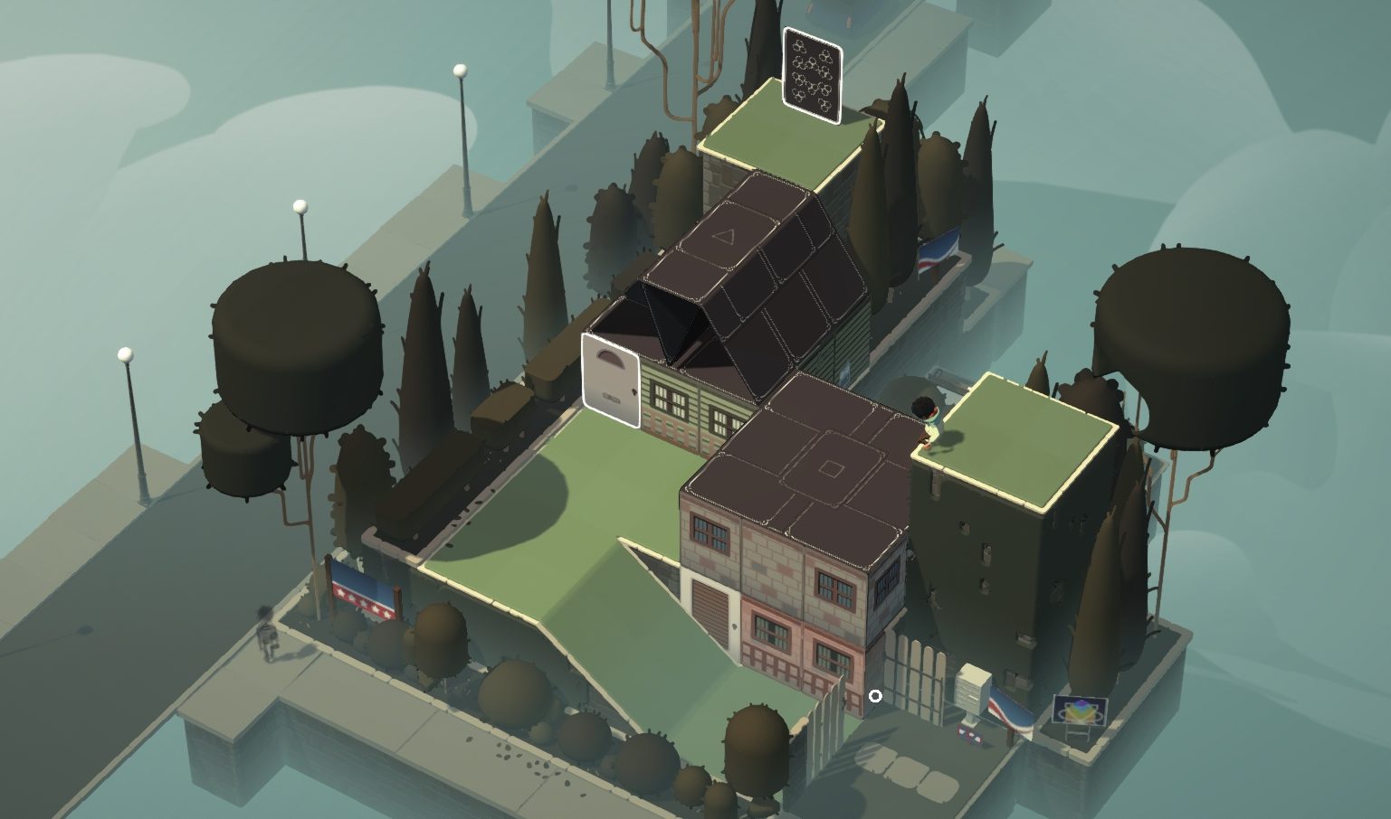
The focal point of Where Cards Fall is the gameplay. For any given level, your goal is simple: Move the player character to the playing card acting as a doorway. To this end, you have controls to run around, jump gaps, and climb down ledges. This is no puzzle platformer, however. Strict rules dictate when you can take actions such as jump gaps which means manoeuvrability is not a skill challenge akin to a platformer; it is another part of the puzzle.
“manoeuvrability is not a skill challenge akin to a platformer; it is another part of the puzzle.”
Where Cards Fall’s unique selling point is, of course, the use of cards. Move cards around and drag them out into a square foundation to build a house of cards upon it. The houses can serve as a structure for traversal, a plane to stack upon, or as bridges to transport cards, for example. The depth of the mechanics on display here is a pleasant surprise.

Creativity has gone into keeping the mechanics from going stale over the campaign. The addition of new cards fills out a larger palette of buildings to construct. Triangle cards make houses with triangular roofs, leading to a walkway at its apex. Other cards construct three-story buildings, including one that resists wind damage. The wind itself is an environmental obstacle to overcome with unstable buildings having floors blown off the top. This is at times an annoyance, at others, another valuable tool.
“[Gameplay] occupies the starring role… it deflects attention from attributes that fail to impress.”
As the mechanics evolve, the difficulty curve starts to emerge, a core part of my criticism. The campaign’s starting levels skew toward being too easy. I appreciate the time taken to explain the mechanics, but the game drags its feet. Following this, the game hits a sweet spot for a while. Eventually, the difficulty overshoots; tedium and frustration soak through the later levels.
The difficulty curve of the game appeared to be a priority. Yet, I’m drawn to talk about other parts of the game. Why is that? Well, the gameplay is important, because it occupies the starring role. Nonetheless, it serves another purpose; it deflects attention from attributes that fail to impress.
Not quite a full house – Where Cards Fall’s story
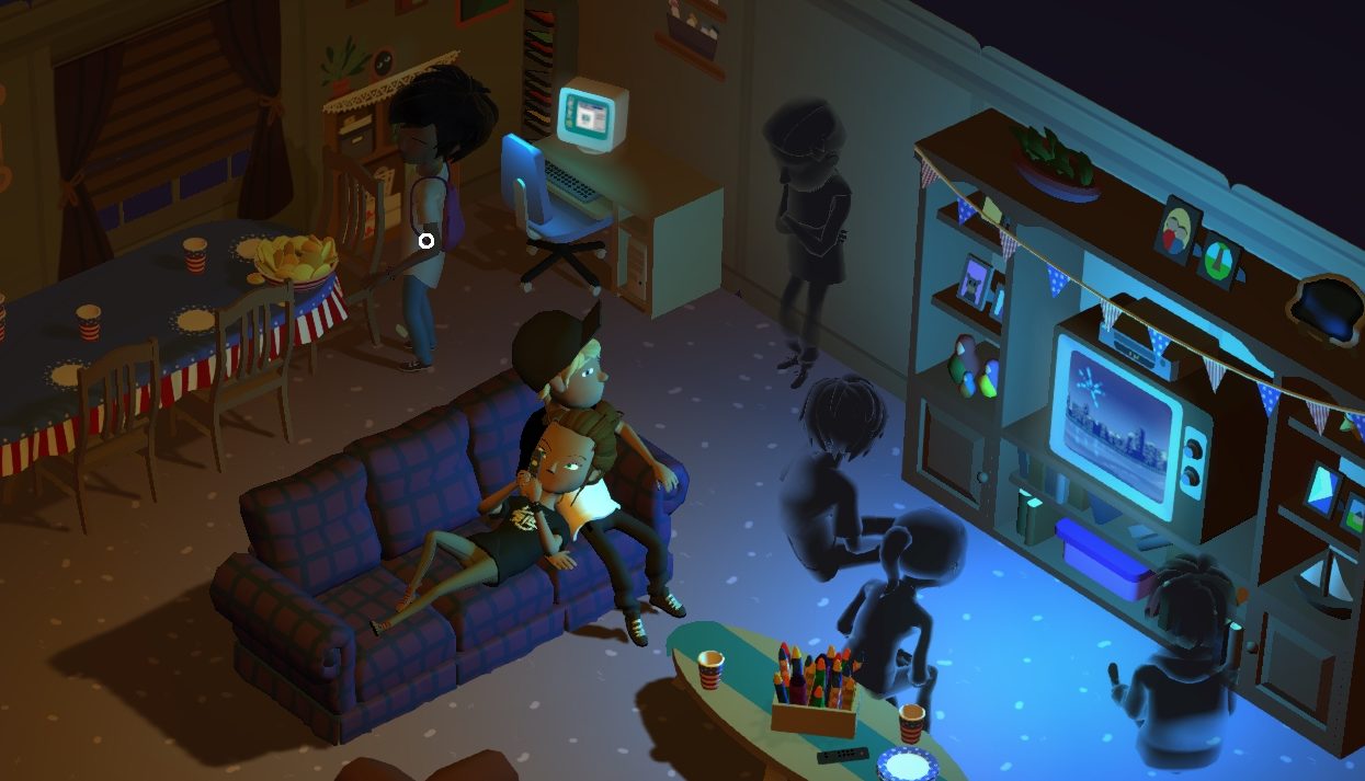
Let’s consider the title “Where Cards Fall”. If you were to guess, what would you say the story was about? I, for one, imagined a tale of an adult filled with regret, reflecting on school, friendships lost, failed ambitions, an unsatisfying career, and lost loved ones. To the best I can surmise, this was an apt prediction.

I am no psychic, of course. I guessed this because it is a cliché. “Abstract, metaphorical manifestations of grief, regret, sorrow and so on” is not ground-breaking material. We shouldn’t impugn Where Cards Fall for this alone. Revered indies follow similar conventions. Having said that, these other titles have qualities that Where Cards Fall lacks. These other titles have narratives with awe-inspiring, unique visuals. They explore the particulars of the characters and their relationships, directing my attention to how these people converse. I want to dig into the layers of specifics, the meanings, and the metaphors.
Where Cards Fall subverts these expectations by sandblasting a lot of the personality off. Where a better title may employ intricate metaphors, this game’s metaphors fall short. The architect making buildings as traversal works to a limited degree. The use of wind as a force of natural entropy works – though this could be a generous interpretation. The symbolism, such as the eyes passing judgment on characters, serves its purpose. Again, this feels reliant on a player doing a lot to follow the lead, where straightforward dialogue would have been easier.
“‘Abstract, metaphorical manifestations of grief, regret, sorrow and so on’ is not ground-breaking material. “
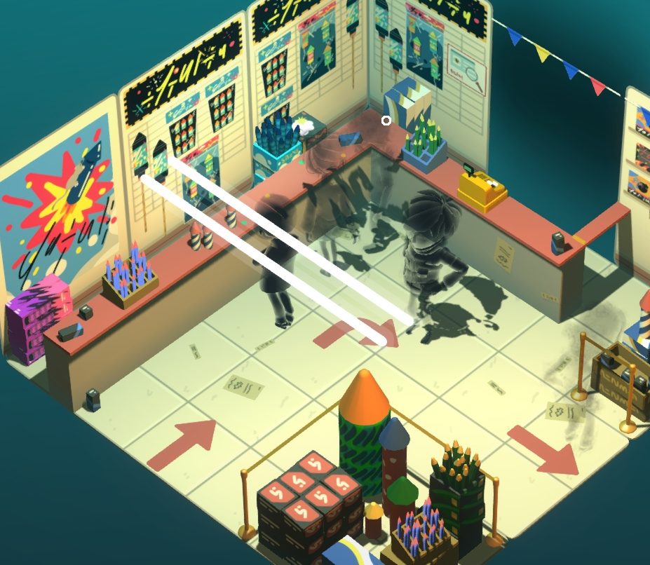
Conversely, Where Cards Fall suffers from a lack of concrete information. The plot is in gibberish with no subtitles, so, hilariously, it takes more effort to read into what’s happening. The point of any scene may be clear; nevertheless, the missteps stick in my mind.
My other issue is narrative delivery: drip-fed through vignettes wedged between levels. The issue, as I see it, is it makes the story an obstacle. If you enjoyed the level, you surely want to jump into the next challenge. The cutscenes stand in opposition; they slam the brakes on. The story, in all its opacity, serves as no reward. It feels like something to wade through. Even replaying this title, the cutscenes persist. My suggestion is to open the level menu and select the next level to move on. The developers, after all, grant no skip button, even to replayers. It is beyond my comprehension why a game would, even after finishing the full title, cling to frequent, unskippable cutscenes like this.
The flourishes and false cuts – The cards’ pretty face
With all the bad-mouthing of the game’s plot delivery, I want to reverse course on the presentation. In the grand scheme of things, the level’s environments look and feel nice. The animations of everything feel fluid and makes the world feel small and delicate. I suppose the standard is to call this a “paper-craft” aesthetic, yet I’m more reminded of a tabletop game. It feels tactile in that sense. This contributes to a sense of fatalism, that things are outside of the protagonist’s control. As elements fell into place, I could soak in these ambiences; I could feel the latent emotions of the world.

Unfortunately, the game’s lovely presentation can lead to friction. The decision to make this title isometric leaves me painfully ambivalent. This style choice is an asset and fault for damn near the same reasons. As a benefit, the isometric view usually allows you to see everything you need to. The level layout and the perspective ensure that everything is visible for you to manipulate. At a glance, placing buildings is easy. By making things more visible, the perspective helps a lot, but this is at the cost of judging distance. Of course, distance dictates your ability to traverse a level; thus, screwing with depth perception is a grave error. The resulting disruptions are minor, but at a high enough quantity to erode the experience.
A chip and a chair – The difficulty curve and the art of misdirection
I find in all my reviews, I happen upon a central theme of my critique. A crucial element, positive or negative, that frames my perspective of the game. For Where Cards Fall, it seemed to be the difficulty curve. Specifically, as puzzles get harder, how does it interact with the other issues of story and presentation? Does the game deflect attention from them? Do they support or undermine each other? Let’s revisit the curve.
When discussing the slow start, my primary concern was the narrative. When starting, I will grant that I did not find the gameplay to be intuitive. I felt like it took longer than needed to become a decent challenge. I appreciate cruising through the campaign, but in this early stage, the plot sets a bad impression; it feels like a speed bump. Following each level, the scene would interrupt any flow I had built up. The story, as you can imagine, did not feel like a reward. All it did was mess with the aerodynamics.
Eventually, the difficulty hits a balance, and in this middle section, the game reaches its peak. We hit the Goldilocks zone: challenging enough to engage, but not convoluted or obtuse. It takes time to solve the puzzle and exit each level. Consequently, the vignettes are a proportionally smaller part of the experience. Longer levels mean the scenes are not fewer, but certainly farther between. This section is where much of my praise comes from: the “board game” feel, the latent emotion. Little frustration remains; it takes time to snowball into anything that upset me.

By the end though, the mood shifts. Later levels remind me of the dreaded sliding tile puzzle. They become pedantic scenes of undoing, redoing, and re-undoing ad nauseam. I suppose this is part of any series of difficult puzzles. This is, in a sense, the result of mounting frustration: an exasperated plea of “when is this over?”.
I must say, however, the hint system is a saving grace. It strikes a fair balance of giving a hint and not an answer. It outlines where the next building should go. This moves the brainteaser in a helpful direction. After all, the hint doesn’t instruct on how to construct the building. The work of manipulating cards to allow for that building’s construction is still the player’s domain. Should this challenge be beyond the player, another hint may be in order. There is a time delay between hints, but it is short. Hints coax you into the next step, push you to try things out with the added help. Nevertheless, the penalty for needing another pointer is modest.
“As Where Cards Fall demonstrates, games are like card tricks: it pays to engage in misdirection.”
Despite this, the game still dragged its feet near the conclusion. This highlighted my issues elsewhere. Shortcomings of the presentation can make level navigation more taxing than it need be. I can’t tell you how frustrating that could become. To throw your hands up in joy, before realising you are a level too low, or one square too far to traverse. That’s to say nothing of walking down a roof, seeing you are too far over, and having to walk back up the roof to then move back. Honestly, even that is ignoring the more likely scenario: Walking up the roof to hit the wrong button and walking back down immediately, at least once. The game’s difficulty was already grating; thus, our protagonist’s detour into the sit-com upturned rake factory was not my idea of entertainment.
This all is to say that the context of these things can matter. My anger may be in a sense misdirected, but every game is a sum of its parts. Nothing I have ever played has been without fault. As Where Cards Fall demonstrates, games are like card tricks: it pays to engage in misdirection.
6
Decent
Positive:
- Mechanic is simple, but well-explored
- Solid middle section to gameplay
- Game looks nice
Negative:
- Too easy at start, a bit hard at end
- Story is too vague, with too many visual metaphors
- Presentation can conflict with gameplay
The parts of Where Cards Fall I remember most fondly are when it gets out of its own way. When the game successfully captured my interest, it directed my attention towards a beautiful world with a welcoming atmosphere. I vibe out on the board game aesthetic and enjoy the puzzles. But when the game is running too fast near the start, or too slow at the end, you can see the faults that are being concealed. Beyond the mask lies a story that does not engage and presentation that at times does a disservice to its mechanics.


