Earlier this week, we brought you the news that Capcom has announced Street Fighter 6. A short teaser trailer shows Ryu and Street Fighter 5 newcomer Luke Sullivan facing off. Most fans would be excited about a new title, but for fans of Street Fighter, it’s been the opposite. As fans have since found humour in the announcement, sharing memes and jokes online.
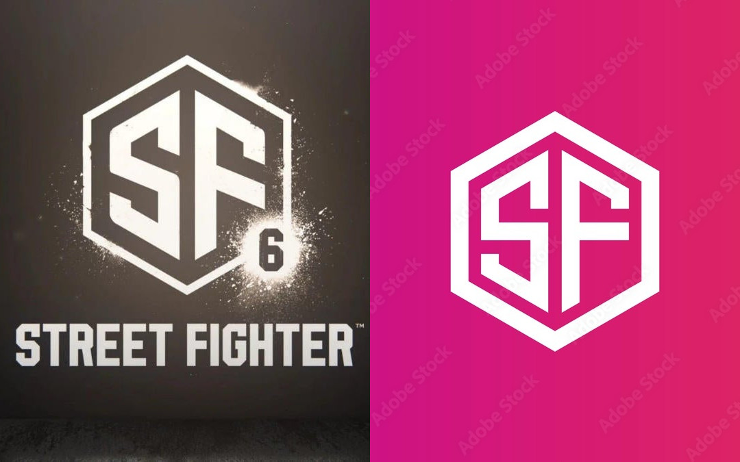
Not only that, but Aurich Lawson, Creative Director of Ars Technica pointed out that the new logo might be an $80 ($87.99AUD) Adobe stock image. In the tweet, Lawson says that while he knew it was a generic logo that about anyone can copy with the right skills, he didn’t realise “it was this bad”. As Lawson points out, someone at Capcom most likely searched for the initials of Street Fighter “on a stock logo site and rounded a couple of corners and added the 6”.
The new Street Fighter 6 logo is $80 on Adobe's Stock site
I don't even know what to say. I knew it was generic but I didn't realize it was this bad. They searched for "SF" on a stock logo site and rounded a couple corners and added the 6
I cannothttps://t.co/SViXFjElou pic.twitter.com/yOzYePaYfV
— Aurich (@aurich) February 21, 2022
Clicking on the link Lawson supplied, allows either a standard license that’s free with a trial or an extended license that costs the full $87.99. The image of the Street Fighter logo and the stock image isn’t exactly the same, as the SF on the left is angled whereas the SF on the right isn’t. And the hexagon lines are thicker on the stock image compared to the Street Fighter, and the SF is thicker on the left but skinner on the right. Other differences noticed are some spray paint and smudges on the hexagon shape. While there are noticeable differences, it is difficult to refute the evidence provided. Whether Capcom will change the logo or keep it as is, we’ll have to wait and see.
Before the news dropped about the logo. Fans were already pointing out how ridiculous it is. In an article by Creative Bloq, they mention how “seriously underwhelming” the new logo is. This new logo makes it seem like Capcom is moving away from its previous logos. Previous logos were an “eyesore with their gradients and striking fonts” that was the charm about these games. But noticing (with the help of fans) that this logo is similar to the UFC (Ultimate Fighting Championship) logo. Meanwhile, IGN’s Brian Altano tweeting that it looks like Street Fighter has “six [unread] emails”.
This logo looks like if Street Fighter got six emails. pic.twitter.com/zITUaVCqHj
— Brian Altano (@agentbizzle) February 21, 2022
We’ll have to wait and see what Capcom does next. There’s no release date for Street Fighter 6 yet, but hopefully, we know more about it soon. What do you think about this whole situation? Are we visiting Yikesville? Or is this a nothingburger? Let us know.

About the Author
Missy Taylor
they/them
Missy is a disabled writer on Boon wurrung land, who is obsessed with Garrus Vakarian and Captain America. You can find them talking about the art of Drag and eating Korean and Japanese food.


